

Mobile-friendly website design
The first thing is to Understand why responsive web design is important you have to take the Google mobile-friendly test for your website. Then use a responsive WordPress theme to create your website mobile-friendly. here are the steps to create a mobile-friendly website.
Step 1: Go to WordPress and select Add new option from Pages.
Step 2: Give your Page name and update it.
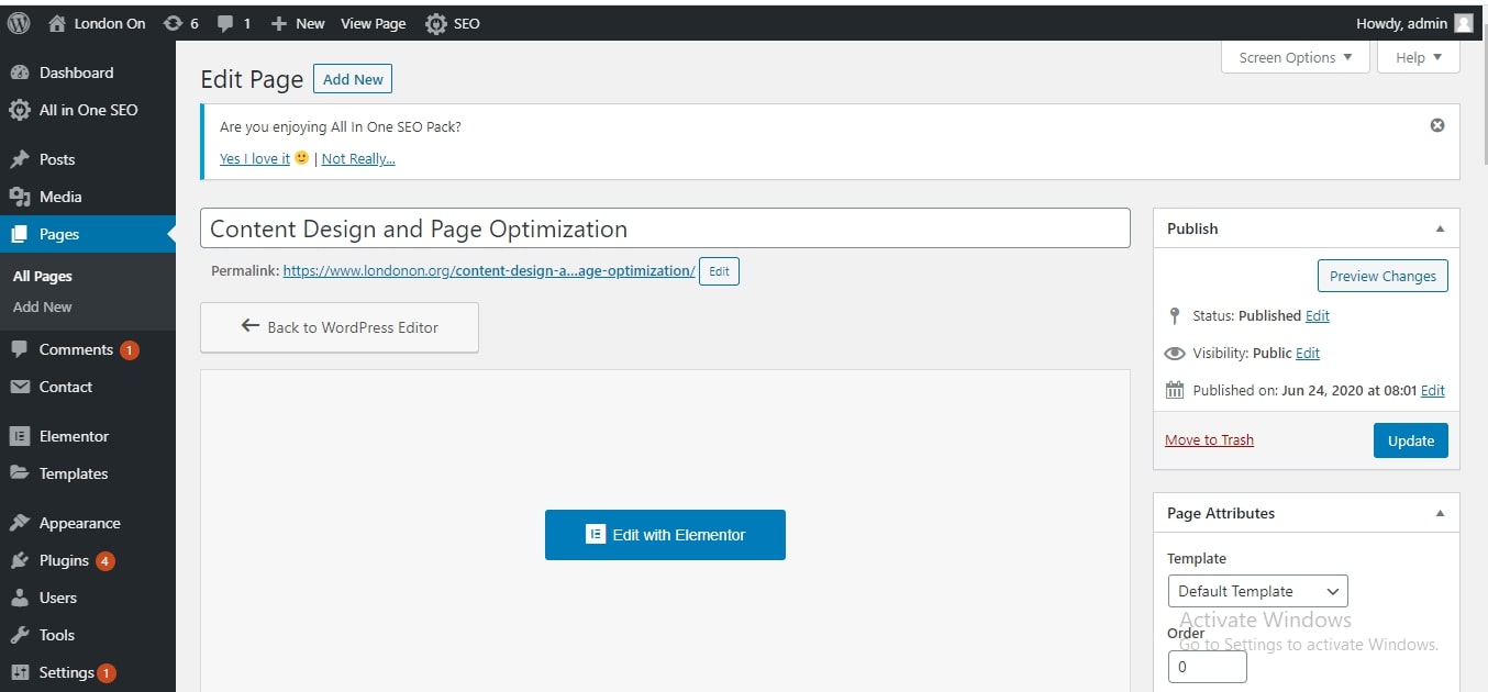
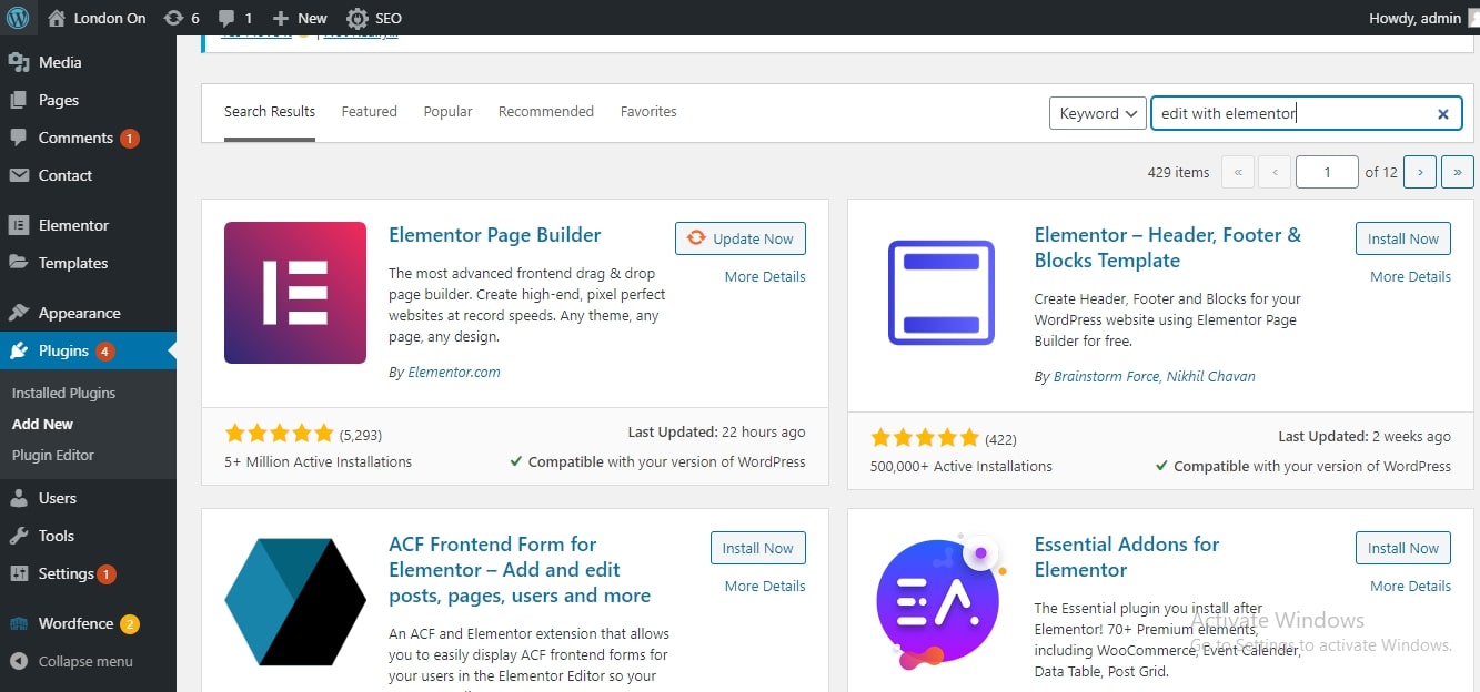
Step 3: Go to the plugin option and install and activate the plugin “Edit with Elementor”.
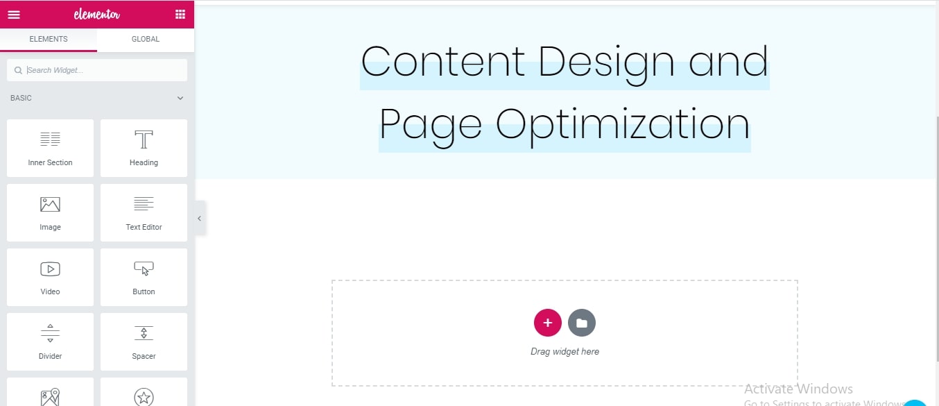
Step 4: When you are going to start edit with the blog by using Edit with elementor, you have to select add option.
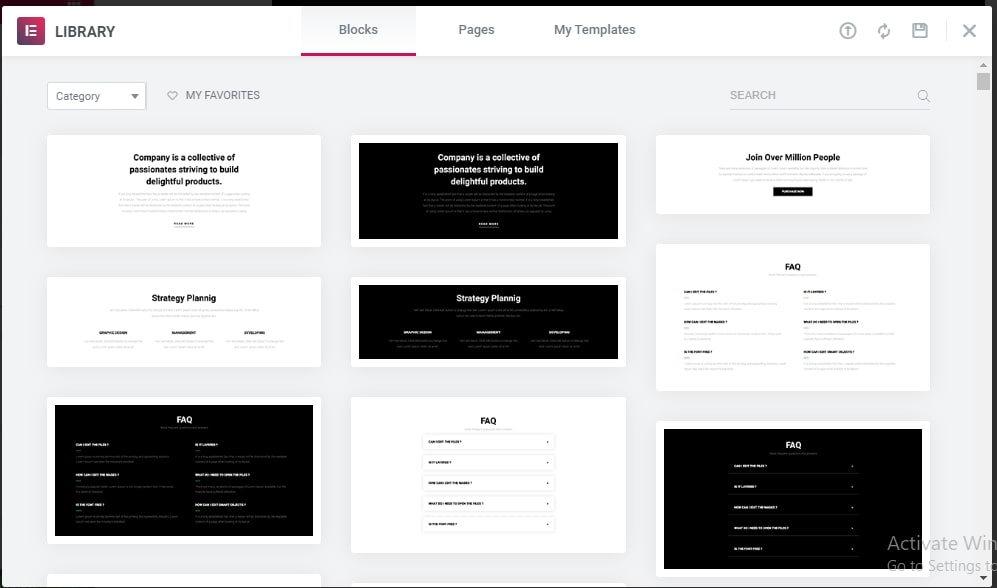
Step 5: Go to blocks option. You can select these templates for your blog. When you are using Edit with elementor, you have to create an account in Edit with elementor. So that you can able to insert the template.
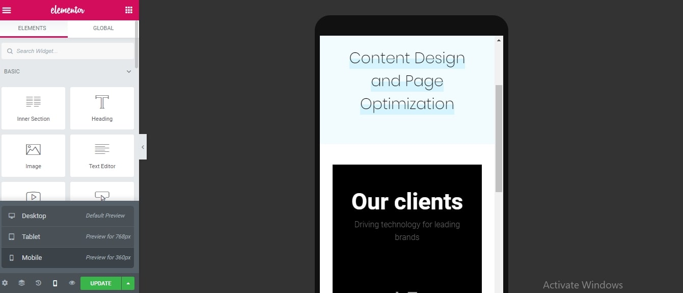
Step 6: To check this block is mobile-friendly or not. Go to the desktop icon and click on it. You can able to see three options. Make a click on the mobile option to know that the block is mobile-friendly or not.
Step 7: There are many tools to design your page. You can use text to write a heading. You can add buttons and images on your page by using tools.
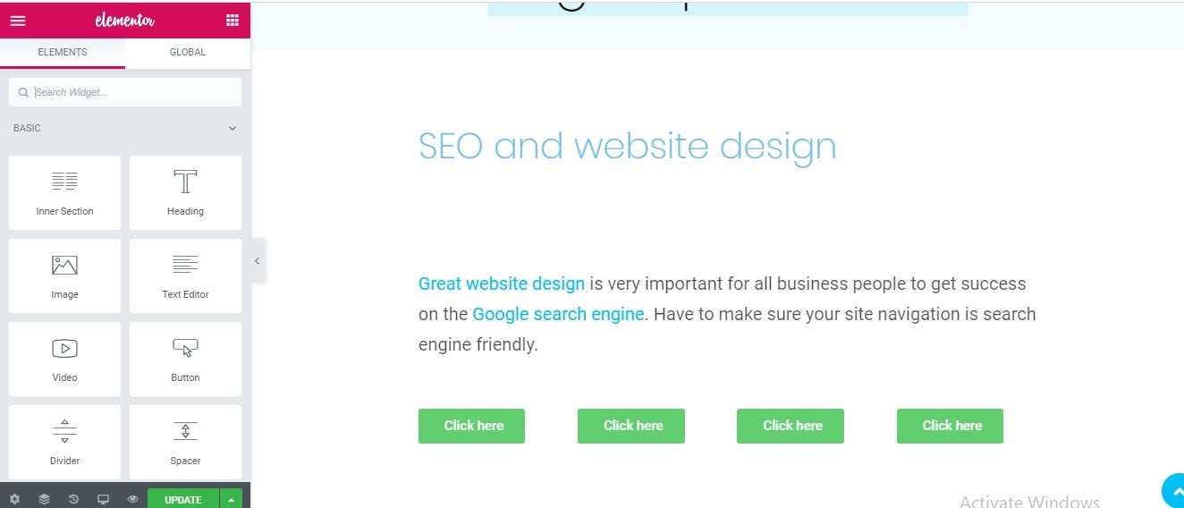
Step 8: You can insert images by using the image tool. You should give an update option to update your pages. Finally, you have created your site mobile-friendly.
View in Desktop:

View on mobile phone:

John Tao